0
What are the Grid Systems in Bootstrap?
1 Answer
0
Bootstrap gives you the option of using the grid system which is considered to be one of the fastest and simplest ways to create layouts. The Bootstrap grid system is known for providing a fast and easy way to create layouts for the web pages being designed. Grid layouts are easily enabled for large devices that vary from cell phones to laptops and tablets to smartphones. The classes used are then changed according to the target device and the desired grid size is obtained.
Bootstrap Grid System allows you to create 12 columns across the page. You can use all 12 columns separately.
Grid Classes
There are four classes used in Bootstrap Grid System.
- xs (for phones)
- sm (for tablets)
- md (for desktops)
- lg (for larger desktops)
Grid System |
Extra-small <576px |
Small ≥576px |
Medium ≥768px |
Large ≥992px |
Extra large ≥1200px |
| Max container width | None (auto) | 540px | 720px | 960px | 1140px |
| Class prefix | .col- | .col-sm- | .col-md- | .col-lg- | .col-xl- |
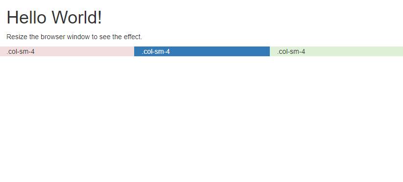
Example
<!DOCTYPE html>

<html lang='en'>

<head>

<title>Bootstrap Example</title>

<meta charset='utf-8'>

<meta name='viewport' content='width=device-width, initial-scale=1'>

<link rel='stylesheet' href='https://maxcdn.bootstrapcdn.com/bootstrap/3.3.7/css/bootstrap.min.css'>

<script src='https://ajax.googleapis.com/ajax/libs/jquery/3.3.1/jquery.min.js'></script>

<script src='https://maxcdn.bootstrapcdn.com/bootstrap/3.3.7/js/bootstrap.min.js'></script>

</head>

<body>

<div class='container-fluid'>

<h1>Hello World!</h1>

<p>Resize the browser window to see the effect.</p>

<div class='row'>

<div class='col-sm-4 bg-danger' >.col-sm-4</div>

<div class='col-sm-4 bg-primary' >.col-sm-4</div>

<div class='col-sm-4 bg-success' >.col-sm-4</div>

</div>

</div>

</body>

</html>