Salesforce provides various Dashboard components to view and analyze your data. Dashboards and Charts of Salesforce are a very helpful visual representation of the reports because charts and dashboards are much faster to look at and understand than reading a report.
Here are explained various Dashboard components:
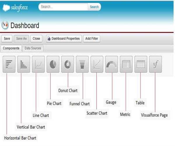
Charts: This is used to show data graphically. There are a variety of chart types to choose.
Types of Salesforce Charts:
Horizontal and Vertical Bar Chart -
Line Chart - this chart is best for showing data over time
Pie / Donut Chart - both the charts are used to compare a group of data to the total
Funnel Chart - this chart is best for sales opportunities
Scatter Chart - this chart helps to visualize the correlation between values on a report
Table: this chart is used for showing report data in column form using the Table.
Metric: this chart is used for displaying a single key value – it is possible to click empty text field next to grand total and enter the metric label directly on components.
Gauge: this chart is used for showing a single value within a range of custom values.
Visualforce Page: this chart is used for creating a custom component or showing information not available in another component type.
Custom S – component: this contains the content that is run or displayed in a browser like Excel file, ActiveX Control, Java applet or custom HTML web form.
[Dashboard - Screenshot]